
Which UX Research methodology should you use? [Chart included]
Start with this question, and all else will follow.
When I first started as a user researcher, I believed there were two types of user research: usability testing and discovery research. I was right, those two types of research do exist, but they are not the only methodologies a user researcher can use to answer questions. But, alas, I was young in my career and believed every problem could get solved in one of these two ways. Am I needed to test a prototype? Usability testing. Am I required to figure out the content? Usability testing or discovery research (depending on my mood). Do I have to figure out how a user feels? Discovery research.
For a while, it was all very black and white. It was a simple time, and one where I believed I could unlock all the answers by using these two methods. I didn’t have to think about information architecture, long-term studies, testing concepts, surveys, clickstreams, A/B testing, the list goes on. Sigh, it was an effortless time.
However, like most people on their career path, I finally hit a wall. I encountered a research question I could not solve with these methods, despite my trying. I did try, and I failed miserably at this.
We were trying to redesign the navigation of our platform and where different features appeared on each page. Notice, we didn’t start with a problem statement or a goal. We started with a solution of a redesign. Also, we already had the redesigned screens. With this in mind, I figured a usability test could solve all of our problems, or validate our pre-defined solutions.
In the end, we decided to do a usability test with the new navigation and layouts. It was clunky, but our participants got through. However, when we released the changes (not too far after the user tests), we found a lot of issues and had to revert to the old designs.
So what could we have done better?
There were many things we could have done better, but I’ll focus on the three biggest ones we could have changed:
- Define why. Defining the why is step one of any research project or initiative. We have to understand why we are doing the research. I often include the why from the user perspective, as well as the business perspective. The why can be a simple paragraph explaining the reasoning behind the project.
- Start with a problem statement. When you start any user research project, it is essential, to begin with a problem statement. A problem statement is a central question that has to be answered by the research findings. In this case, we started with a solution, which led us down the wrong path. By starting with a problem, you are much more likely to solve an actual user need. Learn more about reframing a solution to a problem statement.
- Consider the objectives. By starting with goals, we can understand what we are expecting to learn from the research. We can ask ourselves what we are trying to learn and what we would like the research to achieve. Objectives keep your research on track and align everyone with an expected outcome. Learn more about writing objectives.
Since we skipped straight to testing a solution, we missed these crucial steps. By doing this, we ended up with a suboptimal experience for our users because we didn’t understand what their problems were and what they needed. It is an easy trap to fall into, but easy to avoid by following those steps. Instead, the process should have looked much more like this:
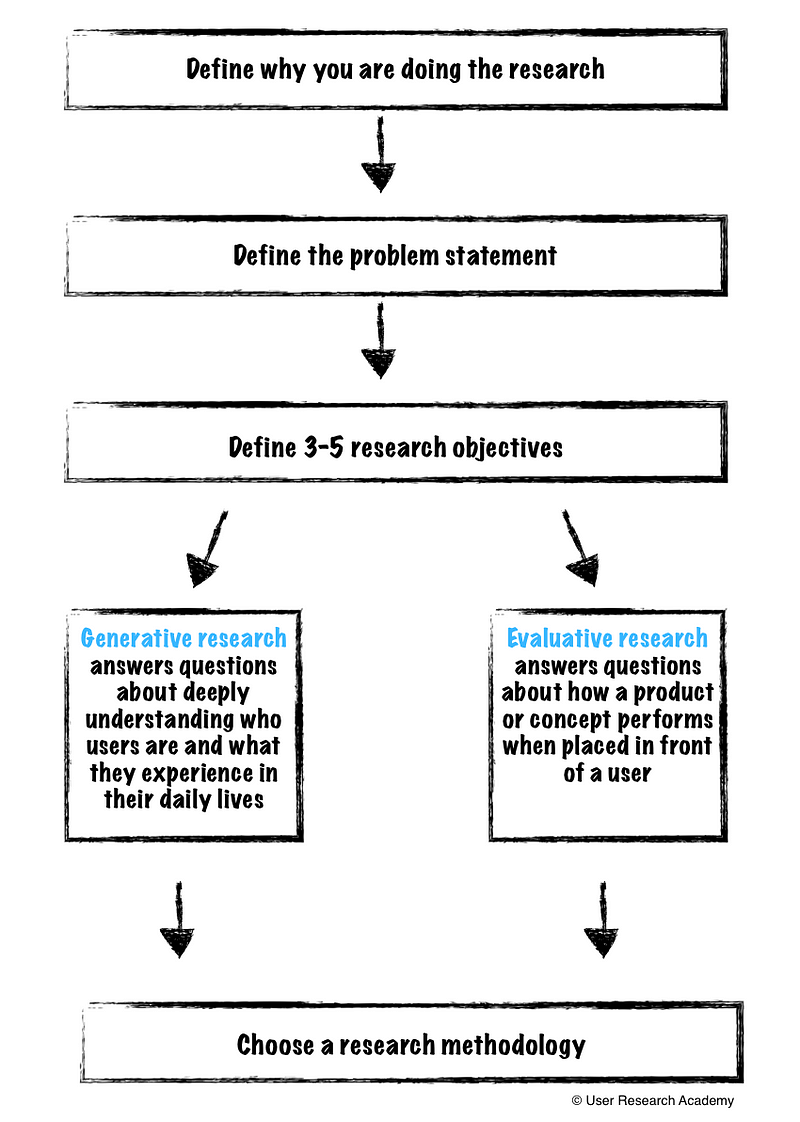
Defining the basics
With the knowledge from above, the outcome of that research project would have been much different. However, I still had the idea that there were only two types of user research: usability testing or user interviews. If only I could have told myself about all the different methodologies out there. Instead of time traveling, I will rewrite history to showcase the process I would go through today to choose a method for the same project.
The project was: Redesigning our hotel concierge platform navigation and information architecture of our features for hotel concierge.
Step 1 — Define why you are doing the research.
We have seen some users struggling when trying to navigate through our platform. Through user research, we have observed users hitting the cmd+f option to find what they are looking for to make the process faster. They are unable to find nested information as they are not sure where to look in our navigation. Also, users have been employing several hacks as opposed to using the features we have built.
Step 2 — Define a problem statement.
I am a hotel employee trying to fulfill a request for more towels for a guest, but I am unable to find that specific feature, which makes me feel frustrated. With this, I have to enter a generic request, and then write in what I specifically need and hope someone reads my notes.
Step 3 — Define the objectives.
- Understand the general workflow of users and when they need access to particular pages/features
- Discover how users are currently using the product
- Uncover the limitations and pain points users are facing in different situations with the platform
- Learn about any potential improvements in workflow, information architecture, or missing features
Choosing between generative and evaluative research
Now here is where things became fuzzy, and where I want to dive deeper. Although now I have a good understanding of which methodologies would have been best for answering the question and objectives, it didn’t always come so intuitively.
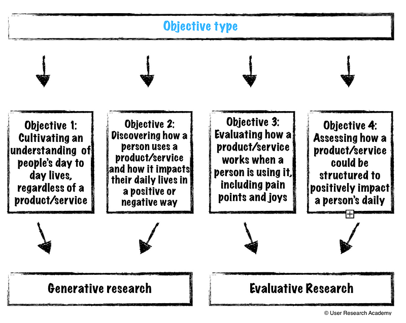
Since then, I have seen four significant types of objectives:
- Understanding more deeply about people’s day-to-day lives, regardless of a product/service
- Discovering how a person uses a product/service and how that product/service impacts their daily lives (positively and negatively)
- Evaluating how a product/service works when a person is using it (pain points and joys)
- Assessing how a product/service could be structured to impact a person’s daily life positively
By breaking these objectives down, we can then choose between generative research and evaluative research.
- Generative research allows a deep understanding of who our users are (inside and outside of a product/service). We can learn what they experience in their everyday lives. It allows us to see users as human, beyond their interaction with a product/service.
- Evaluative research is about assessing how a product/service works when placed in front of a user. It isn’t merely about functionality, but also about findability, efficiency, and the emotions associated with using the product/service. Many people think evaluative research = usability testing, but it goes much further than that
- Hybrid research is a combination of generative research and evaluative research. The example I’ve used above can very well end up being a hybrid method. Hybrid research helps us simultaneously understand our users, as well as how a product/service is performing. Now, this is not magic and, since it covers both spaces at once, it does not go as deeply into a place of understanding or evaluation. I will focus on hybrid research in a future article, as it is a more advanced technique.
Once we understand what type of research we are looking to conduct, we can better understand which methodology ties best to our objectives. I have included a chart of methods I have used, and how they relate to the above goals I have realized.
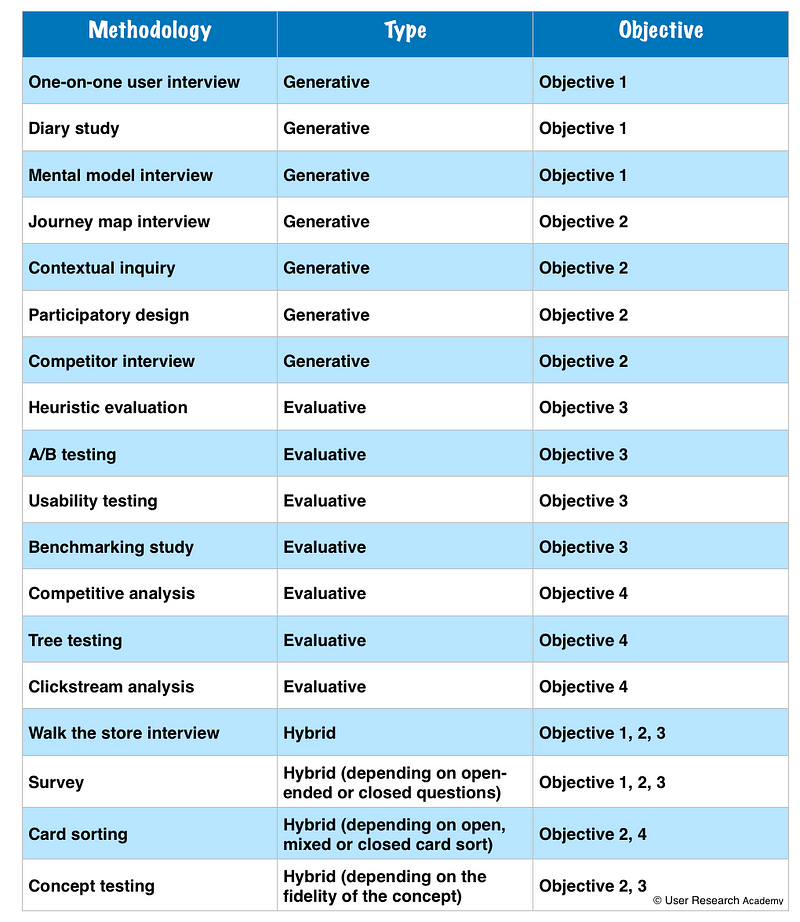
If you are curious, for the research project I mentioned above, I would have suggested the following methods:
- Contextual inquiry
- Walk the store interview
- Card sorting
Now, none of this is an exact science, and your opinions may differ on this, which is fantastic! I would love to hear about how you approach this differently.
Interested in more user research? I teach an Introduction to User Research Course and am available for one-on-one mentoring. Check out the User Research Academy. Please join the User Research Academy Slack Community for more updates, postings, and Q&A sessions
Is it time we move beyond the NPS to measure user experience?
Why the NPS sucks and what to use instead.
I get an overwhelming sense of grief and anger when I see the Net Promoter Score (NPS) being used as a beacon of light for companies. I have heard so many people praising the NPS, and using it as a legitimate way to measure customer satisfaction and success of a company. In fact, sometimes, it is used as the only way to measure these metrics. But, I really believe, the NPS should not be the basis of making critical decisions.
As user experience and user research gain traction in the tech/product field, there are so many additional ways to gather feedback, measure satisfaction, and pinpoint where you are disappointing your users. The NPS feels like a very archaic metric that stuck around simply because it is easy. And, to be honest, the other suggested metrics in this article are more difficult than the NPS, but there is a reason behind that.
What exactly is the NPS?
If you have ever tried out a product or service, you have probably seen this question before:
On a scale of 0–10 how likely are you to recommend <product or service> to a friend or colleague?
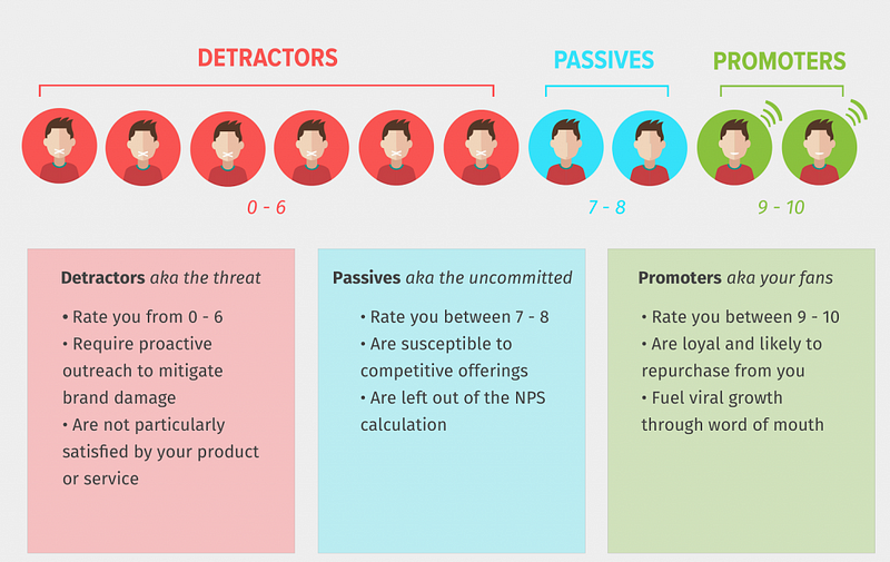
Your NPS is the accumulation of people who use your product or service taking the time to rate whether or not they would recommend your product or service to others. Based on the score they give your product or service, they fall into one of three buckets:
With this information, you are able to calculate a score that you can measure across time. The formula to calculate the score is:
Net Promoter Score = % of Promoter respondents minus % of Detractor respondents
Remember, passives are kept out of calculations, so any scores of 7–8 essentially do not exist in terms of scoring.
As an example, let's say you received 100 responses to your survey:
- 40 responses were in the 0–6 range (Detractors)
- 30 responses were in the 7–8 range (Passives)
- 30 responses were in the 9–10 range (Promoters)
When you calculate the percentages for each group, you get 40%, 30%, and 30%.
To finish up, subtract 40% (Detractors) from 30% (Promoters), which equals -10%. Since the Net Promoter Score is always shown as a number (not percentage), your NPS is -10. NPS scores can range from -100 to +100.
In addition, the NPS appears to do things that other business metrics don’t or can’t. It is:
- A single question that is easy to understand
- Easy to calculate and measure
- Easy to track any changes over time
- Widely accepted in business
Why the NPS is a suboptimal metric
There are a few reasons why I think NPS is not the most ideal metric to use as a single metric. I am in no way saying, “never use the NPS again!” If you want to continue measuring NPS, just understand what you are really measuring and consider additional metrics to track alongside the NPS.
- Why is recommendation a sign of satisfaction? There are so many different reasons why one might or might not recommend a product/service to a family member, friend, or colleague. Sure, we could assume the mental model of “I am satisfied with this product/service, therefore I would recommend it,” but this still leaves many situations unanswered. What if it simply doesn’t make sense to recommend the product/service to these people because they never use anything like this? Or maybe you are unsure about the value since you haven’t used it a lot. Maybe you hate it, but someone else in your life would benefit from the product/service. There are many different contributing factors to recommendations, and they don’t always lead to product success and customer satisfaction
- Recommendations are contextual and subjective. Similar to the above statement, whether or not someone gives a recommendation can be completely subjective and based on context. Would I recommend a movie I just saw to others? Maybe. It depends on the person. If it was a comedy, I would potentially recommend it to my friends who like comedy, but not my friends who like action or thrillers. I could have also had a terrible night with bad popcorn, and lumpy theater seats, causing me to dislike the movie because of circumstance, rather than quality. Or I could have simply been having a bad day, and that impacted the experience I had with a product/service, causing me to give a bad score. There is a multitude of reasons why recommendations are extremely contextual and subjective
- NPS calculation overshadows success. The weird calculation of the NPS score does a great job of hiding improvement and success. The above example gave us an NPS of -10. Now, let’s say we work super hard to make some great changes to the product/service. We know we are on the right track because we are using user research insights to help give direction to these changes (biased, I know). So, it turns out we have increased those scores, and we receive many more 6’s and 7’s. For some reason, the NPS counts the 6’s as 0’s (detractors) and the 7’s don’t count (as they are passives). So, ultimately, our NPS is still -10, despite the improvements we have made. This simply does not make sense
- You do not know what type of user is responding. The NPS does not care or categorize the respondents to the survey. So, we don’t know if the people who are responding are power users, new users, or even our target personas for the product. If we have spent time building for certain types of personas but are getting scores from other people out of our scope, that can completely skew the results. It is also easy to skew the results in the other direction — you could be getting good reviews from people who you are not at all trying to target
- Cultural differences could impact your score. If you are a global company and are collecting responses from many different countries, it is extremely important to study the NPS data per country. There are vast differences in how cultures respond to these types of surveys, which can really mess up your data if you are lumping them together. It is best to keep an eye on the country or region your responses are coming from and to separate that out
- An 11-point scale is really large. The NPS gives a very large range of responses as an 11-point scale. In fact, it is one of the largest scales. The distinction between the numbers is not at all clear, and most likely does not make sense from person-to-person. You and I could have the same exact experience but I would give the product a score of a 7, and you give the score of a 6. What is the difference between 6 and 7? It is very hard for respondents to understand this difference, and to choose a meaningful response. It is almost the same as closing your eyes and picking between two numbers
- There is no data on ‘why’ someone gave a particular rating. Aside from all of these, my biggest gripe with NPS is that there is no understanding of why someone gave a particular score. Receiving a rating can be rather useless if you don’t understand the motivation behind the score. Without the ‘why,’ there is no way for a company to determine how to improve a product or what direction to move in. Perhaps it was an error beyond your control that led to a lower score. Without understanding the ‘why,’ you can spend much time and energy trying to guess what went wrong and how to fix it
- It is completely future-based. I do my best to avoid asking future-based questions. We want to focus on what people have done in the past, as most of us cannot predict our future behavior (think of all the gym memberships that go unused).
What to do instead (or in addition to)
Now that I have bashed the NPS as a single-source metric, I would love to give some alternatives to the NPS or to measure alongside the NPS. We all know people love numbers and measurements and there are some other questions we could be asking (hint: they might not be as easy, but could be more effective). You can even continue to include the positive/negative aspect of the NPS.
Frustration:
- How delighted or frustrated were you today? — Extremely delighted (+2), delighted (+1), meh (0), frustrated (-1), extremely frustrated (-2)
- In the past X weeks, have you felt frustrated with our product/service? — Yes (-1), Unsure (0), No (+1)
Helpfulness/happiness:
- Have we been helpful today? — Yes (+1), Unsure (0), No (-1)
- Have we made you happy today? — Yes(+1), Unsure (0), No (-1)
Loyalty:
- In the last X weeks, did you recommend us to a friend or family member? — Yes(+1), No(-1)
- Have you ever recommended us to a friend or family member? — Yes(+1), No(-1)
- Were you recommended to us by a friend or family member? — Yes (+1), No (-1)
- In the last X weeks, have you considered [canceling your subscription, switching to another provider, etc.]? — Yes (-1), No (+1)
Satisfaction:
- How satisfied are you with [company X]? — Very dissatisfied (-2), Dissatisfied (-1), Neither (0), Satisfied (+1), Very satisfied (+2)
- How easy was it to complete your order online? — Very easy (+2), Easy, (+1), Neither (0), Difficult (-1), Very difficult (-2)
Finally, always leave an open-ended text field asking something along the lines of “how could we improve?” This adds to the qualitative input you can receive to give you a better indication of what went wrong and the context of the situation. This will help in providing more clear direction towards product/service improvements.
Ultimately, user experience and satisfaction cannot be boiled down to one singular number. Let’s keep an open mind about what we measure, how we measure, and why we are using specific metrics, so we are best able to make better, well-rounded data-driven decisions. And, don’t forget to add in some qualitative research as well!
If you liked this article, you may also find these interesting:
- Asking about the future in user research
- A case for beta testing
- First-person surveys in user research
- Benchmarking in user research
Interested in more user research? I teach an Introduction to User Research Course and am available for one-on-one mentoring. Check out the User Research Academy.
Please join the User Research Academy Slack Community for more updates, postings, and Q&A sessions
Ten emotion heuristics: how to read a participant’s body language

As user researchers, we take words very seriously and place most of our importance on what our users are saying. While this is, in fact, where our attention should be placed, we should also consider the body language of our users during our research sessions. I’m not talking about “rage-clicking” or clear sighs of frustration (although those are important too), but more of the subtle body language.
A while back, I wrote about how important a user researcher’s body language is during an interview, and now I want to write about the other side: the user’s body language.
Why is this important?
One of the number one principles (at least one of mine) of user research is:
watch what users do versus just listening to what they say
When we focus all of our attention on what people are saying, we can miss what they are actually doing. And, unsurprisingly, what people say and what they do can be quite different.
I have a perfect example of this. I was conducting usability tests on a new flow we were thinking about implementing. One of the main tasks our users had to do was download multiple images at once. We didn’t make this easy and, previously, our users would have to hack downloading them at once. Once we finally had the resources to tackle this project, I was super excited to test our ideas.
We had one idea in particular we thought was a sure winner. I couldn’t wait to test it with users. We showed it at about ten usability tests and, luckily, I had my observation mindset on. Many of the users said they really liked it. They could finally download multiple images at once. HOWEVER, the majority of users, while telling me that they liked it, struggled with understanding the flow and completing the tasks. In fact, three users clicked on many different areas and appeared visibly frustrated, but still said it “wasn’t bad.”
Had I just been listening and using words as data, I would have pushed forward this idea. Instead, I noticed the struggles. During the interview, I was able to dig deeper into the frustrations beyond the surface. This allowed us to better understand where we needed to improve the UX.
It was after that particular test I started looking more into how to observe user’s behavior and body language during research interviews. I wanted more than retrospective or current self-reporting measures. I searched and found a method that relies on real-time observation of behavior and coding of participants’ facial expressions and gestures. Its creators, Eva de Lera and Muriel Garretta-Domingo call their method the “Ten Emotion Heuristics.”
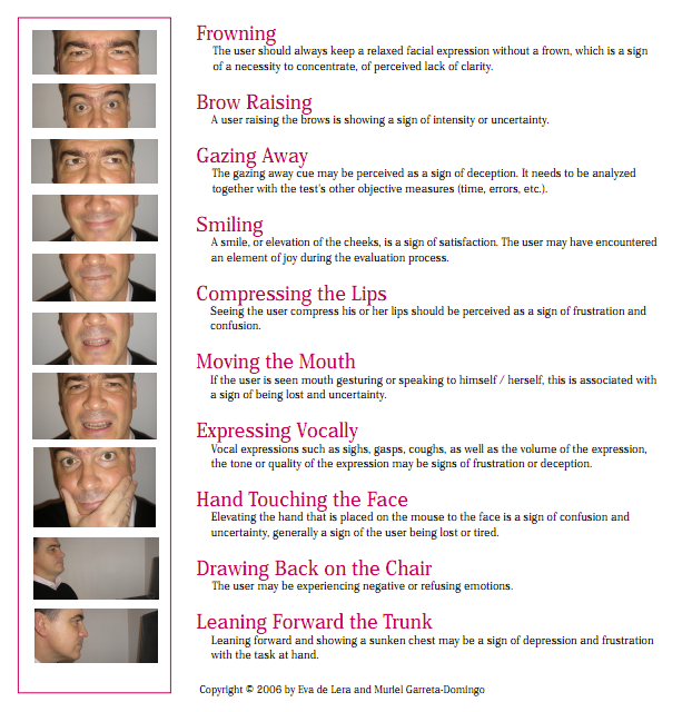
The Ten Emotion Heuristics:
The heuristics are a set of guidelines to help assess what a user is feeling beyond self-reported measures. As mentioned above, there are times where users actions and words do not match up, and you can use the below heuristics as a way to understand what the user is really feeling, beyond the feelings they may be aware of.
- Frowning. If a user is frowning, it can be a sign of a necessity to concentrate, displeasure or of perceived lack of clarity
- Brow Raising. When users raise their brows, it can be a sign of uncertainty, disbelief, surprise, and exasperation. While surprise isn’t always negative, we don’t necessarily want our users to be surprised or uncertain of the experience on our platform
- Gazing Away. When a user gazes away from the screen, they may feel deceived, ashamed, or confused. They could also very possibly be bored with what is on the screen in front of them
- Smiling. A smile is a sign of satisfaction in which the user may have encountered something satisfying or joyful
- Compressing the Lip. Seeing a user compress their lips is a sign of frustration and confusion. I see this a lot when a user intends to do something, but it does not work, causing frustration and anxiety
- Moving the Mouth. If the user is speaking to themselves, trying to understand or complete a task, this indicates them feeling confused or lost in the experience
- Expressing Vocally. Vocal expressions such as sighs, gasps, coughs, as well as the volume of the expression, the tone or quality of the expression may be signs of frustration or deception.
- Hand Touching the Face. If a user is touching their face during the interview, they could be tired, lost, or confused. This can also indicate a high level of concentration and frustration with a task.
- Leaning Back on the Chair. When a user (or anyone, really) leans back in a chair, it is an indication they are having a negative emotion and would like to remove themselves from the situation. This generally shows a fairly high level of frustration
- 10. Forward Leaning the Trunk. Leaning forward and showing a sunken chest may be a sign of difficulty and frustration with the task at hand. At this point, the user may be close to giving up on a task or experience.
How to use these heuristics
The great thing about the ten emotion heuristics is that they are all 100% observable and cost-effective. The best thing you can do while learning these is to practice. Here is how I have learned to incorporate the emotion heuristics in every one of my interviews. These don’t have to be done step-by-step, but could be thought of that way!
- Memorize the different heuristics
- Practice the heuristics with others — both doing them and observing them
- While practicing with others, write down which heuristics you observe and compare notes
- Record each of your participants and assess heuristics AFTER the interviews — compare notes with a colleague on what heuristics you both found and at what points
- Observe and make note of heuristics during the interviews. See if you can dig deeper during those. Assess the interview after as well to see if you were accurate
- Rinse and repeat until you feel confident observing and noting the heuristics in real-time
Some things to note while you are practicing:
- Always record your participants during the interviews. Even when you are a “pro,” you might miss some instances. Make sure you can see their facial expressions in the recording!
- Have a colleague with you to compare notes (especially in the beginning)
- Take it slow! You won’t learn or notice these all over a short period of time
What can we do with this information?
There are a few different ways I like to use the emotion heuristics, and they all have really benefited my analysis of research studies.
- Observing behavior over words. What people tell you and how they act can be different. The emotion heuristics can give you an indicator of how someone is really feeling at a given moment
- Some negative emotion heuristics appear outside of the concepts that we are testing. This helps give an indication of where we might need to improve the overall user experience of the product, outside of what we are testing
- You can measure if there are trends with certain emotion heuristics across the experience. Are the majority of participants exhibiting particular emotions during one task or flow?
- If many negative emotion heuristics are surfacing during a task, flow, or experience, you can prioritize fixing that issue higher than others
- By identifying the different cues across the interview, you can rate whether the participant’s experience was overall positive or negative.
- Give scores to tasks and overall experiences, which can help with calling attention to issues and prioritization
Although it might sound simple, using these emotion heuristics can be quite tricky. You might get a participant who doesn’t display many expressions or a participant who displays too many at once to count. User research isn’t an exact science and you will never get the perfect participant. The best you can do is practice and observe these signals participants are putting out. They won’t be the answer to all your questions and, sometimes, they may lead you down the wrong path, but they are another tool to put in the user research toolbox.
—
If you liked this article, you may also find these interesting:
- ACV Laddering in UX Research: A simple method to uncover the user’s core values
- User Research Isn’t Black & White and how to navigate the grey area
- Benchmarking in UX Research to test how an app or website is progressing over time
- How to Assess Your Research Interviews: A framework to continuously improve
If you are interested, please join the User Research Academy Slack Community for more updates, postings, and Q&A sessions :)