Stop (or traffic) light usability testing reports
A simple and effective way to visually convey usability testing results.

I sometimes struggle to find ways to present user research that is both digestible and actionable. Qualitative research tends to primarily include words, quotes, audio clips, etc. With this methodology, reports can become text heavy, and difficult or time-consuming for team members to read. This is especially tough if you are working with a new team, coming in for a short time as a contract worker or trying to convince people to actually read your research. However, qualitative research, especially usability testing, is extremely important to do, and to share across a company.
After several attempts to share usability test results, I found that stakeholders weren’t gaining the most value from my reports. I set out to find a different way. I started by talking to the stakeholders involved. I asked them what information was most important to them and effective techniques they have employed when sharing reports. With this, I could understand the hierarchy of information they needed and better prioritize my reports. From there, I did my own research into how to present usability test findings. Finally, I came to something called Stop Light (or Traffic Light) Usability Testing Reports and have adopted and adapted this as my method of sharing usability test results.
What are they?
People do stop light reports differently, and I have seen different methods. I will share with you the way I set up my reports. They can show a few different things:
- Conveys whether or not a user has passed a usability testing task
- Includes how severe the problem is in a task
- Shows amount of time spent on a task, by task and participant
- Averages how many participants passed/failed a given task
- Summarizes how the usability test went through visuals
The most valuable part of the stop light approach is how visual it is. It can easily give a stakeholder a holistic overview of how the usability test went. Additionally, I have put in more information, including:
- After the usability tests, you can put UX recommendations based on the results of the sessions, and link them to the different tasks. If you want to, you can also color code these similarly, that way it is all in the same place with the same format!
- This is also a great place to include notes on the participant, either by someone who is taking notes during the session, or can be added in after. That way, you can link certain notes up to the given task.
- Shared assessments by all stakeholders watching the research session. Each person can work directly on the same document (I use Google Sheets), and rate the usability test on their own. By doing this, you can see if your stakeholders also thought the participant was unclear about a task, integrating stakeholders into the research and making the research more valuable.
How do I do this?
In the spirit of visuals, instead of just explaining stop light tests, I want to share a visual example of one of my reports (it is all dummy data).
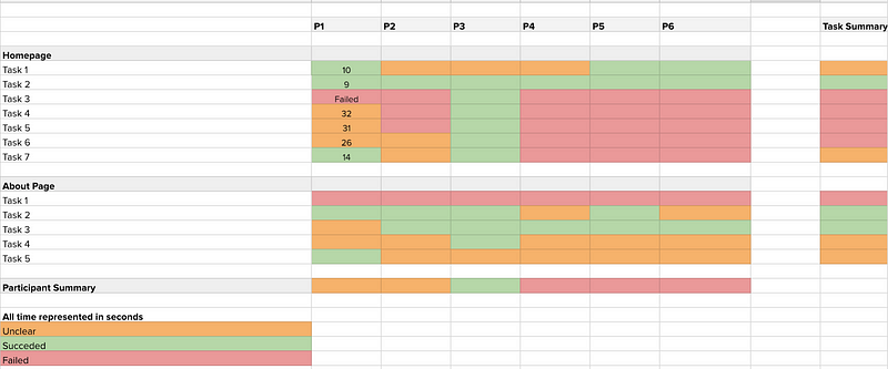
In the above example, there are different components:
- Each participant has their own column, with a participant summary at the bottom
- Each task has its own row, with a task average summary all the way over to the right
- The three colors indicate whether a participant succeeded in a task, was unclear in the task or failed the task — these can also be used as severity ratings. The red are the most important fixes, orange are medium priority and any problems within the green tasks are left for lowest priority
- The time for each task is recorded within the taskXparticipant bubble and can be averaged per task
There are a few things you have to do before you go out and start using this approach when sharing your usability tests.
- Make sure to define what passing, succeeding and unclear mean for each given task — this is something you discuss with other stakeholders (designers, developers, product managers)
- It is also beneficial to benchmark and average how long tasks generally take users. That way, this data is useful. For example, if task 4 on the homepage usually takes users 10 seconds to complete on the current product, and it is taking users over 30 seconds on the prototype, that is a huge red flag. If you don’t have any benchmarking data, it might be worth doing some benchmarking before you go out to usability test
- Get some buy-in! Before I started sending these out to my stakeholders, I presented the idea to them and they actually gave me some great feedback that made the transition easier and more valuable for everyone involved
Overall this approach has really helped me clearly and effectively share usability testing results with colleagues, and has given them much more value than a written report. It makes it easy for people who just want to glance at the results, to understand what the priorities are (summary), but also gives the option of digging deeper into the results (notes) and includes actionable insights based on the test (recommendations). Download the template I use here.
Again, there are many ways to do this, and I’d love to hear about your approaches or feedback!
[embed]https://upscri.be/ux[/embed]